I don’t always remember the sites I want to use as examples after seeing them in the wild, so I am going to start documenting them. This series has two uses, to inform the site in question of a potential issue, and to help me remember an example.
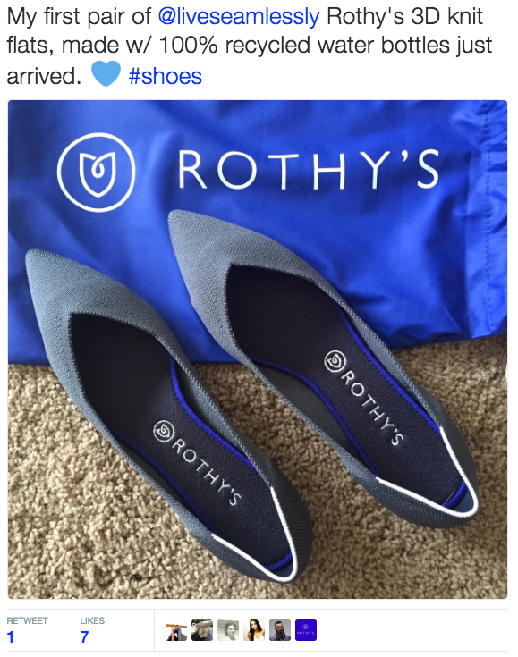
Today, we are going to look at Rothy’s. My wonderfully brilliant friend, Akvile, mentioned them on Twitter. I’m rarely on Twitter anymore, but was this morning and saw her mention.

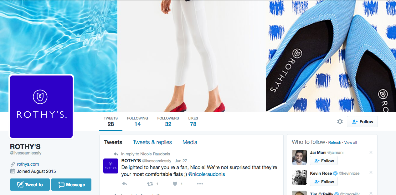
Fantastic mention, tweet, image, all of that. I clicked their name and immediately went to their Twitter profile to get their site and see what was up.
On a side note, I feel bad for the political guy that owns @rothys. He’s going to want to give that up soon, if these shoes are that good. 😛 I love the @liveseamlessly name for branding and future expansion (underwear anyone?), but I can see future problems.

First tweet is them replying to a happy customer. Awesome. And the images look very calming. I’m hooked. Now, to their site I go.

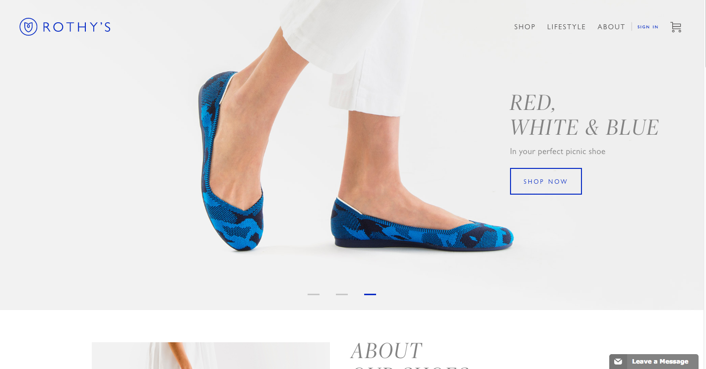
We can see that their main call to action is to buy. Usually I am all about this, but that is not what I am there for as someone that is at the top of the user funnel. I don’t know anything about this brand. I think they are like Tieks. I hope cheaper but more comfortable than traditional flats.
Recommendation: First, slow the roll on the slider. It changes every three seconds. Try five. And then add in one in about the brand. You’re new, this should still be a focus, brand education.
But down there, just before the fold on my Macbook without the toolbar (please know the standard screen size of your users when designing!) is the word “About”, so that tells me to scroll.

Awesome. This is what I want. I click there.
Side note: There is more below that on the homepage, but I didn’t see any of it as this answered my question and there is a ton of white space between this and the next item. I recommend making this flow better to scrollers.
So back to what I did. I clicked on Learn More. This is what I see next:

I have to click Learn More again?!?!?!?!?!?! I mean, technically I can scroll down, but clicking the same thing again is weird.
This page is the second focus of the homepage. The page it links to should get straight to the point. Don’t make me scroll and please don’t make me click Learn More on an About page.
About me as a visitor to Rothy’s:
- User Persona: 30s working professional, speaker and client facing
- Part of funnel: Top, Discovery Portion (User Funnel Example)
Take aways:
- In site development, write out all possible personae, try to describe what type of computer they used to find you, including screen size. Each persona should be different. Mobile is a part of this as well as set top boxes.
- Understand the multiple ways someone might enter the site. Each person is coming in on different pages and at different parts of the funnel, plan for each. Examples:
- Discovery, Homepage
- Discovery, Blog post
- Realization of Need, Facebook ad to homepage
- Consideration, Homepage
- Consideration, Blog post
- Conversion, Facebook ad to product page
- Conversion, Twitter
- Conversion, Homepage
- Don’t make users work to get the answers they need.

